SecuTix online sales has a whole new look! Fresher, simpler and more contemporary, the new graphic theme is right on trend. We present Equilibrium, a fully harmonised, balanced theme that will change the online visitor experience for the better.


A contemporary, balanced theme
Equilibrium is much more than a graphics layer. This new theme is intended to enhance the user experience. We've completely redesigned the on-screen information for more impact and a clearer hierarchy to achieve a balanced look. The new imagery conveys all the information while reducing page complexity. We've increased the spacing between elements to put more emphasis on the pace of the page content and on giving your content room to breathe. The result: improved readability. The redesign was also an opportunity to create a simpler appearance, especially by using areas of white space. We've consciously made embedded content easier to see.
So Equilibrium is more contemporary. It takes its inspiration from flat design and particularly Material Design, the set of design rules put forward by Google. In line with this, Equilibrium is built on Steve Matteson's Open Sans typeface which is available free from Google Fonts. Optimised for web and mobile, this interface provides excellent readability and comes with five layers.
To solve the problem of the base width of the current theme, which really wasn't sufficient anymore, we've increased the centre content column from 700px to 970px. The overall page layout is now 1220px on large screens.
The end result is a more contemporary ticket shop that will captivate visitors.
Graphic customisation is changing
Just like the classic SecuTix theme, Equilibrium can be graphically adapted to suit your corporate identity.
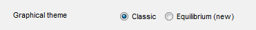
For as long as PizBernina V1 runs, you'll be able to choose between the classic theme and Equilibrium. To make your selection, go to the "Internet Theme" page for the point of sale concerned, where you'll find two radio buttons that allow you to switch. To maintain backwards compatibility the customisable fields shown (such as colour, background image, rounded borders, etc.) haven't changed in the settings window; however, they produce slightly different results than before. So before switching to Equilibrium, we recommend that you do a reset (link at top right of page).
Please note that the classic theme will only be available for a limited time, so we'd encourage you to migrate to the new theme during PizBernina V1.
Usage recommendations
Here's a list of usage recommendations to help you make the most of Equilibrium's elegance while also conveying your visual identity.
Typeface
Layout is now more flexible thanks to the larger centre column: you can now change the font of any text – not just headings.
Unifying background colours
One of the biggest advantages of the new theme is the unified colour selection .So we'd encourage you to use the same background colour for the main area and the heading background. If you change the main background colour but leave the heading backgrounds blank, they will automatically adapt to the main background.
It's important to note that there are three background colours for English content, "Body background colour", "Background colour" and "Embedded area background colour". These three variables allow you to define:
- the background colour of the main content
- the colour used for alternation (e.g. where the background alternates between two seat categories, which is sometimes called the pyjama effect)
- the colour of embedded content.
For best results we think it's preferable to choose three different colours that progress in one direction: for example, the Equilibrium base colours are pure white, very light grey and a slightly more solid grey. Note that the embedded content colour can also be used for borders. Ideally this should contrast slightly with the main background colour.
Background images
You can still choose the same background image for the whole page. However, if you use an image with too high a contrast or add transparency effects to the internal background colours you may find that the content is less readable.
The background image for the centre area is no longer available.
Buttons and links
Equilibrium apporte davantage de granularité aux boutons d'appel à action (Call to action).
Les actions principales sont toujours représentées par des boutons de couleur distinctive. En revanche, les actions secondaires se déclinent désormais en trois niveaux.
- Les plus importantes sont de couleur distinctive et s'accompagnent d'une icône.
- Les actions simples n'ont pas d'icône associée
- Les actions qui ne sont pas souhaitables (par exemple, une annulation) ne sont pas en couleur et apparaissent dans la couleur du texte standard.
Signalons également que la possibilité d'arrondi s'applique désormais à d'autres domaines que les boutons.
Couleur du texte par défaut
La variable de couleur du texte par défaut s'applique à de très nombreux éléments, mais parfois avec de petits effets d'allègement (légère opacité). Ne vous étonnez donc pas si certains éléments apparaissent un peu plus clairs ou plus foncés: c'est un effet de nuance recherché dans Equilibrium.
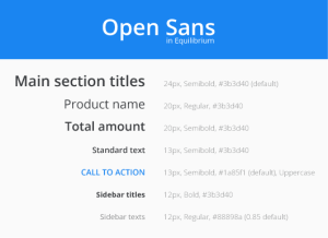
Mapping des couleurs
L'image suivante décrit précisément les variables qui influencent les aspects visuels dans Equilibrium. Retrouvez ces variables en consultant le document: equilibrium-color-mapping.pdf.
