Design your emails for both desktop and mobile at the same time by instantly visualizing the result and making adjustments without having to go to preview
Solution
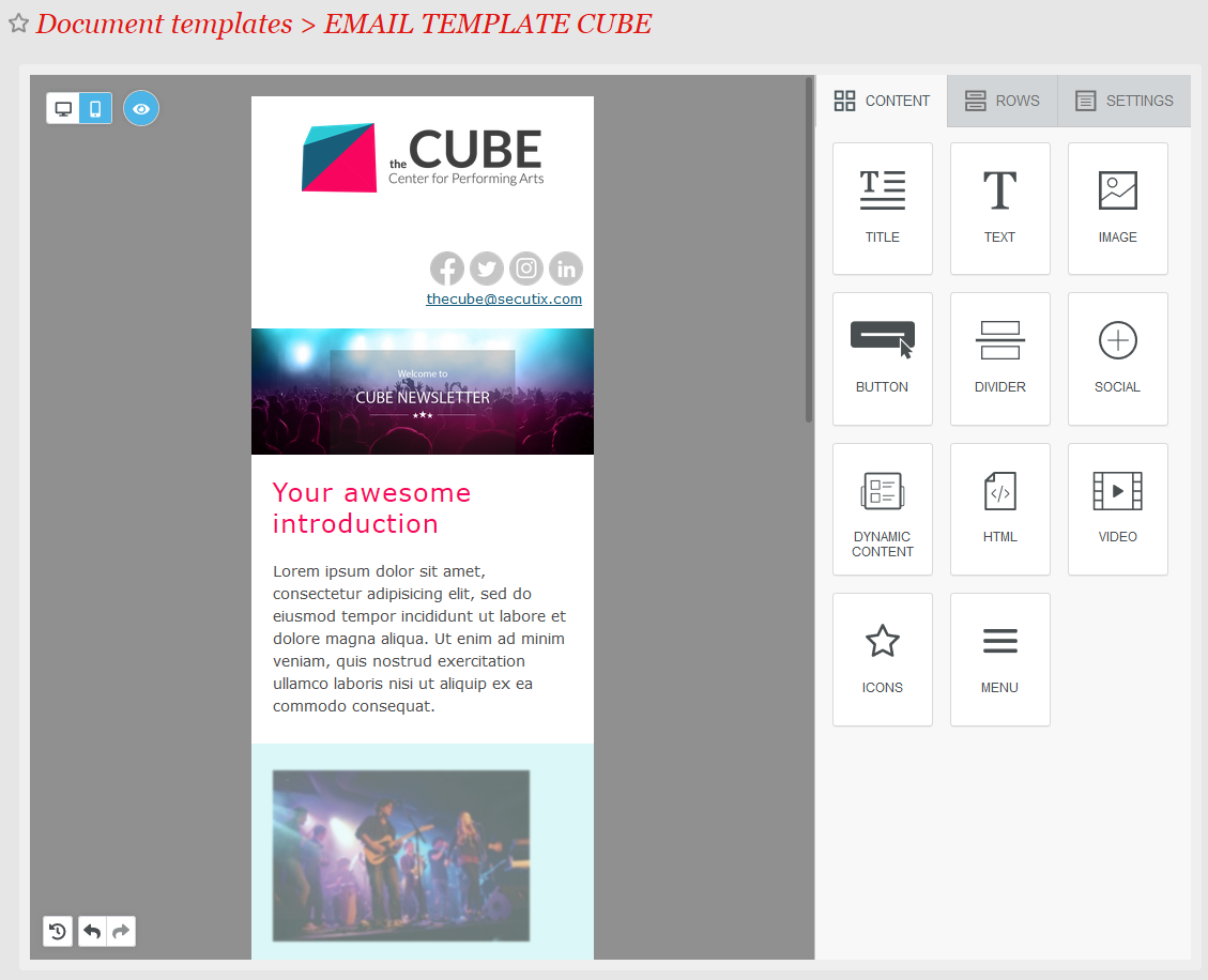
The new designer editor is now even easier to use with the new "mobile design mode" switch, which allows you to instantly visualize and edit the specific design for both mobile and desktop. We also move the editor to its own screen for an improved user experience.
Getting started
In the template pop-up, you now have a new Email menu entry to open the editor. The screen is also accessible directly from the list of template by clicking on the Edit message button.
In the Designer editor, on the left hand side, you now find the buttons to switch between the desktop or mobile view. If certain elements are configured to be hidden in one view or the other, a Visibility button allows you to toggle between displaying/hiding those elements.