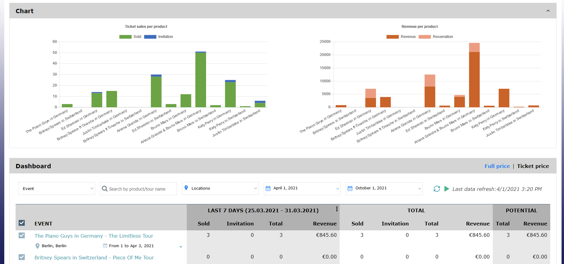
TED, the executive dashboard, has had a small addition but with a big visual impact.
We have continued with TED's make-over, by adding two colorful charts at the top of the dashboard.
Solution
The two new charts present the measures of the table below, i.e., the number of tickets and the revenue, to give life to those numbers.
Getting started
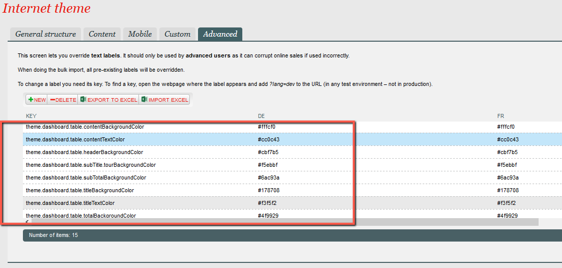
The display of the chart panel can be toggled from the Advanced tab of the Internet theme of the point of sales, where you can also define the colors used in the charts.
Here are the different configuration keys:
- config.gravity.dashboard.showChart [true/false]
- config.gravity.chart.revenueChart.revenue.color [hexadecimal color]
- config.gravity.chart.revenueChart.reservation.color [hexadecimal color]
- config.gravity.chart.ticketSoldChart.sold.color [hexadecimal color]
- config.gravity.chart.ticketSoldChart.invitation.color [hexadecimal color]