Liste des Dashboards & Rapports standards.
Liste des Rapports de Gestion du Public.
Liste des principaux indicateurs clés de performance (KPIs) :
| KPI | Définition/calcul |
|---|---|
| Capacité | Le volume total de billets initialement disponibles à la vente. |
| Billets vendus | Total des billets vendus (résas & remboursements exclus). |
| CA par billet | Le chiffre d'affaire moyen. Calculé en prenant le CA global divisé par le nombre de billets vendus. |
| Rabais moyen par billet | Le rabais moyen par billet représente la différence entre le prix de base unitaire par billet et le montact réellement payé. |
| Fréquentation | La fréquentation représente le nombre de billets vendus divisé par la capacité. |
| Différence avec hier | Utile pour comparer des séances d'un même événement. Met en lumière la fréquentation en comparaison avec la veille (ou tout autre période temporelle sélectionnée). |
| CA max. | Il s'agit du chiffre d'affaire maximum si tous les billets disponibles étaient vendus au prix plein (check with ASI). |
| Perfomance CA | Il s'agit du chiffre d'affaire des billets vendus divisé par le CA max. Cela vous montre la performance de votre CA. |
| CA par siège | Vous donne la valeur moyenne d'un siège. Il s'agit du CA des billets vendus divisé par la capacité. |
| Fréquentation moyenne | Nombre de billets vendus + billets réservés divisés par la capacité |
| Cumul annuel à ce jour (YTD) | La période qui s'étend du début de l'année en cours jusqu'au jour présent, exclu. |
| Année complète | Aucune restriction; affichage de l'année complète. |
| Réduit | Représente la part de billets qui n'ont pas été vendus au prix plein (check with ASI). |
| Gratuités | Tous les billets qui ont été donnés gratuitement. |
| Ventes moyennes en nb de jours avant la séance | Nombre moyen de jours entre la date d'achat et le jour de la séance. |
| Horizon d'achat | Indique le moment où un billet a été acheté en termes de jours avant la séance. Les valeurs possibles sont: Jour de la séance ou après, Semaine passée, Mois passé, 3 mois passés, 6 mois passés ou antérieur. |
| Dernière visite | Date de la dernière visite (de la séance la plus loin dans le temps pour lequel le contact a un billet). |
| Estimation prochaine visite | Si A est la médiane de tous les intervalles en jours entre les visites consécutives d'un client, l'estimation de la prochaine visite est: la date de la dernière visite + A. |
| Nb. de jours depuis la dernière visite | Représente le nombre de jour entre aujourd'hui et la dernière visite du contact. |
| Intervalle moyen de fréquentation en jours | Cela représente la médiane (en jours) de tous les intervalles entre les visites consécutives d'un contact. Il s'agit d'une estimation du nombre moyen de jours entre les visite d'un contact. |
| En retard (estimation) | (Intervalle depuis la dernière visite) - (Intervalle moyen de fréquentation en jours)*1.5 1.5 étant un facteur de tolérance. Si la valeur est positive, cela signifie que le contact est en retard sur son rythme habituel de visite. En revanche, si la valeur est négative, cela signifie qu'il est venu plus tôt que prévu. |
| Distance par rapport à l'institution (en km) | Distance en km entre le contact et votre institution. (Calcul basé sur les codes postaux.) |
| Prix moyen par billet | Représente le montant total dépensé par un contact pour l'achat de billet divisé par le nombre de billets achetés. |
| Achat: Nombre de jours avant la séance | Représente le nombre de jours entre l'achat effectué par le client et le jour de la séance. |
| Clients par événement | Ce nombre vous indique combien de contacts ont acheté au moins un billet pour un événement donné. |
| Fréquentation moyenne par contact | Total des séances auxquelles le contact est venu. |
Liste des rapports:
| Dashboards & Rapports standard | Description |
|---|---|
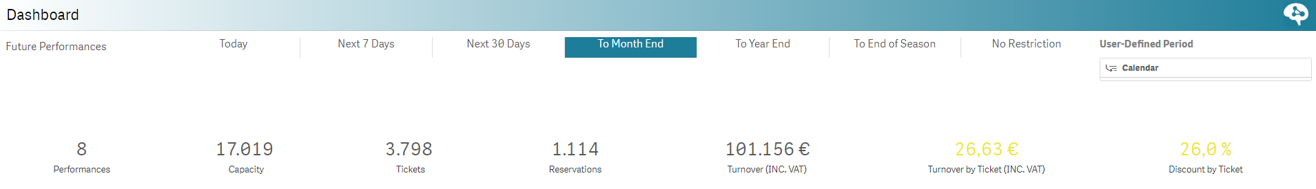
| Dashboard | Ce dashboard vous offre une vue d'ensemble idéale de vos séances à venir! You pouvez choisir dans la partie du haut la période à considérer et suivre en coup d’œil vos ventes, places disponibles et autres indicateurs clés de performances. Ce dashboard est parfait pour un suivi quotidien des séances à venir.
|
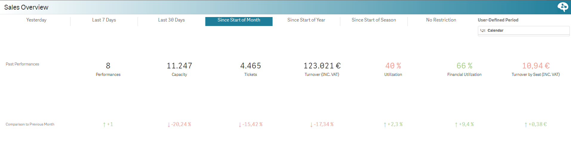
| Vue d'ensemble des ventes | Ce rapport fait le point sur les dernières ventes sur la période de votre choix (hier, 7 derniers jours, etc) et vous offre une comparaison avec la période équivalente passée (hier/avant-hier, cette semaine/semaine passée, etc). Vous visualisez ainsi facilement si vous ventes performent ou non. Les KPIs à suivre:
|
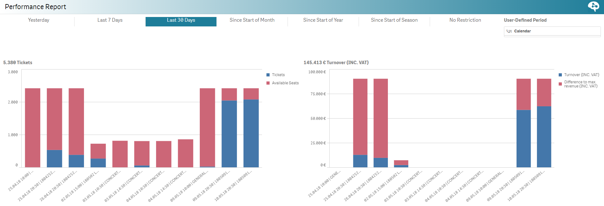
| Rapport de séance | Ce rapport vous donne une vue d'ensemble des ventes sur vos séances passées sur une période de temps choisie. Le tableau de gauche montre le nombre de billets vendus (en bleu) comparé au nombre de billets encore disponibles (en rouge). Le tableau de droite se concentre quant à lui sur le chiffre d'affaire en vous montrant en bleu le CA actuel et en rouge le CA maximum (cf définition des KPIs). Ce rapport vous offre une lecture efficace de vos ventes pour les séances passées.
|
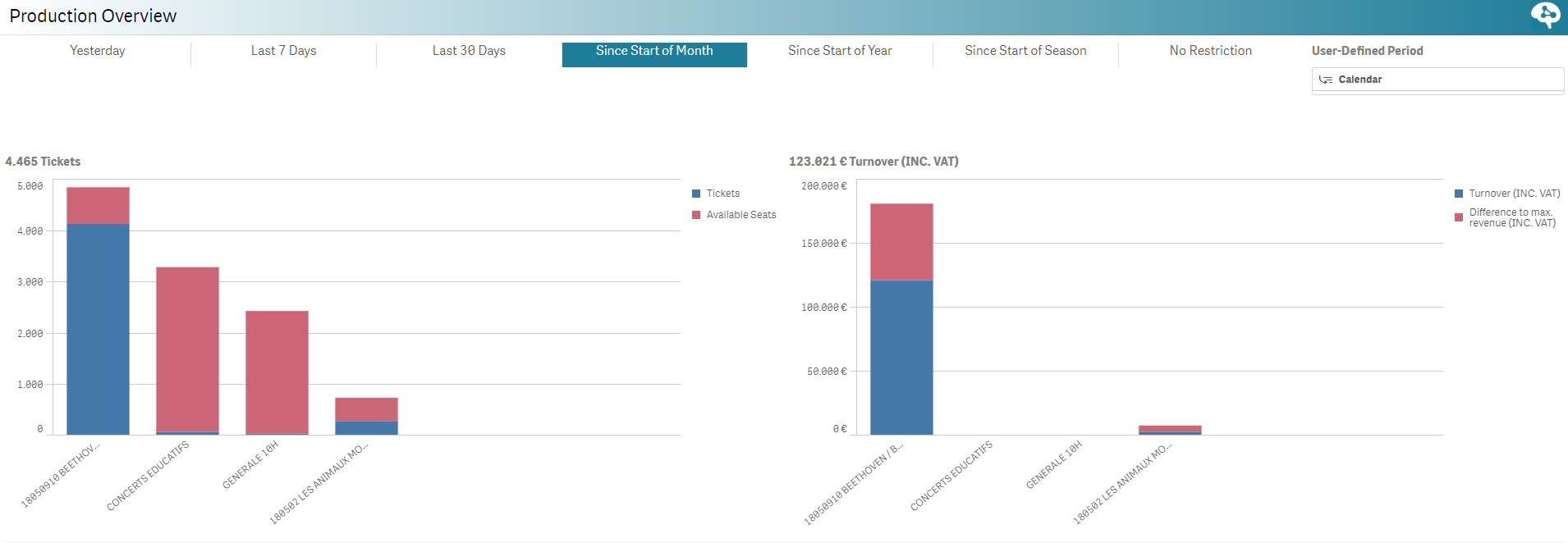
| Vue d'ensemble de l'événement | Ce rapport est très similaire à Vue d'ensemble - Séance à la différence près que les données sont groupées par événements. Il est donc idéal pour suivre des événements qui ont plusieurs séances.
|
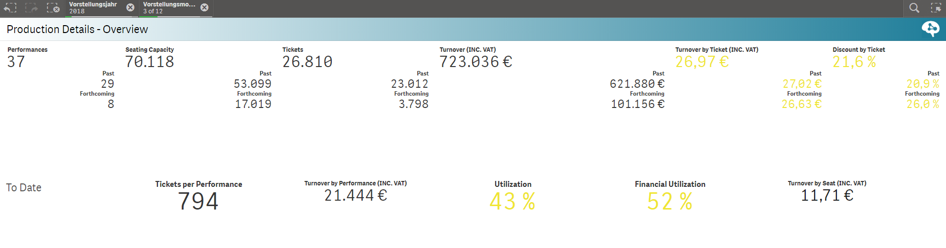
| Détails de l'événement - Vue d'ensemble | Ce dashboard vous montre les chiffres clés de vos événements sur une période définie (utilisez l'écran de sélection des données pour définir un mois, une année, une saison par exemple). Vous y verrez ainsi le nombre total de séances sur cette période, la capacité, les billets vendus, etc. Ce dashboard vous donne une vue d'ensemble The Overview is a dashboard showing key values of all events from a defined period (use data selection screen for exemple to select the time frame). You can see the total performances, the coming /past ones, the capacity, number of sold tickets, etc. It will give you a great overview of where you are and where you are heading. The table on the bottom can be grouped by year and months, months and days of the week thus allowing a structured view on the productions.
|
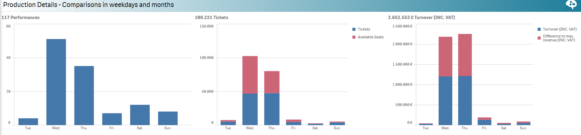
| Détails de l'événement - Comparaison par jours et mois | This report will give you some insights on your activity in terms of weekdays and months. Thus, you can quickly see which days of the week have the most performances in average, the highest turnover or amount of sold tickets. You can have the same information in terms of months. See which months/days of the week are the busiest ones!
|
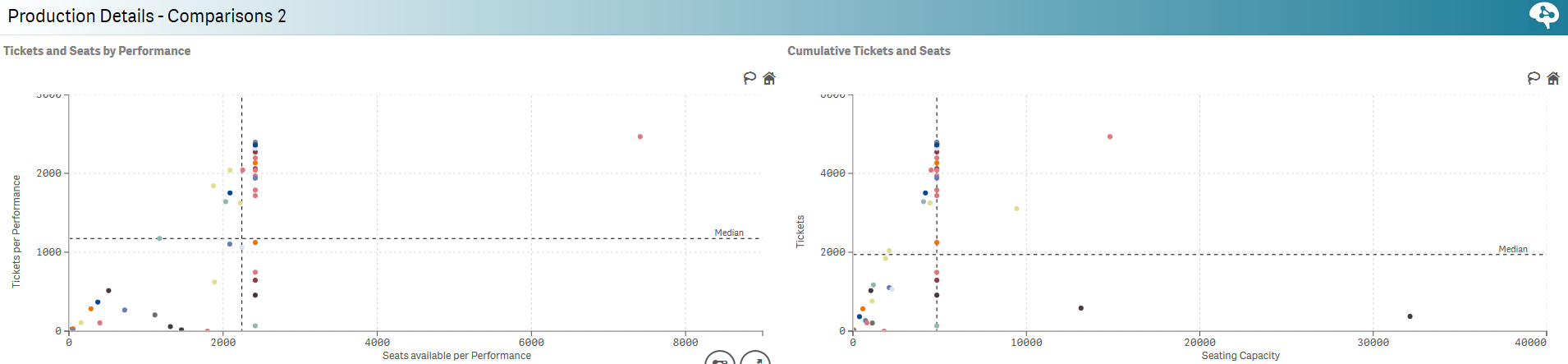
| Détails de l'événement - Comparaison 2 | This report is worthy to be understood as it enables you to compare events (with single or multiple performance(s)) in terms of ticket available vs. sold per performance and cumulated. It is very usefull to help you determine the balanced number of performances you should plan for a given event for example. Composed of four scatter plots with the following content:
|
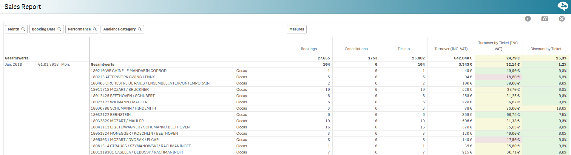
| Rapport de ventes | This report focuses on amount of sales on a daily basis. It will show how many tickets have been sold and if it was for occasionnal contacts, season ticket holders or members. You will also see the turnover split among these audience. The table at the bottom gives you more details on the sales, booking, cancellations and the split by events.
|
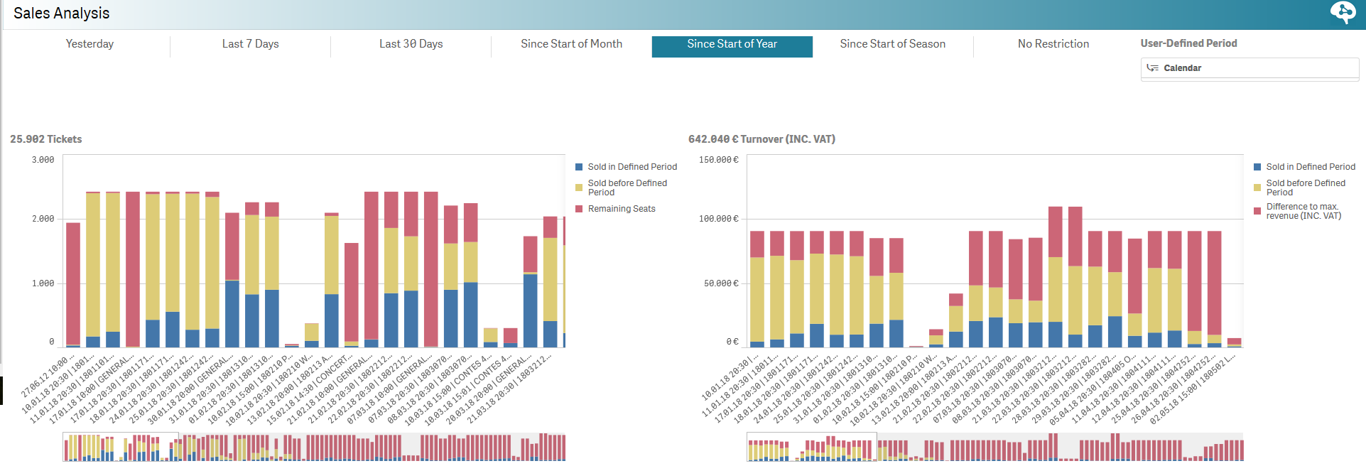
| Analyse des ventes | This report focuses on the period the tickets were purchased for a given performance. Select "Since Start of the year" and check when did people purchased their tickets? Was it during this periond (in blue) or before (in yellow) and what is the proportion of remaining available seat on sales. The table at the bottom gives you some details on the seat categories, booking, etc.
|
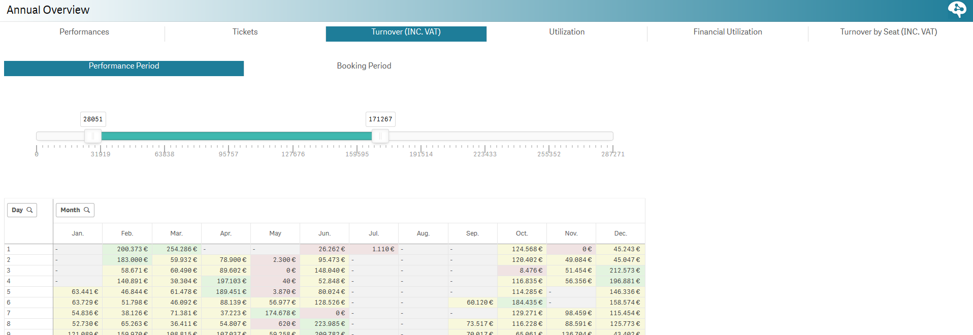
| Vue d'ensemble annuelle | In this report, the user is able to select from two dimensions that can be crossed: Dimension 1: Performances, Tickets sold, Turnover, Utilization, Financial utilization and Turnover by Seat. Dimension 2: Performance date or Purchase date. The range slider enables you to change the thresholds to determine the background colors (green, yellow, red) of the table. Here below, we are focusing on the turnover from the point of view of the performances date. We see the turnover by day of the months on annual basis. We can at which time of the month the tunrover is the highest and compare it with other months to determine whether there is a recurent patern or not.
|
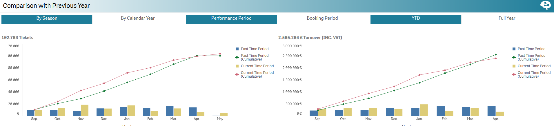
| Comparaison avec l'an passé | This report is simply a must to follow-up on your sales! You are able to compare sales volumes (tickets sold & turnover) and compare with the same past period. For exemple, below we care comparing two seasons and check the sales months by months and on a cumulative basis as well. Once can see that sales were better in Februrary 2017 than 2018 but were better this January. The table at the bottom will enable you to go deeper in your analysis and sort data by months, productions, sub-themes or venues.
|
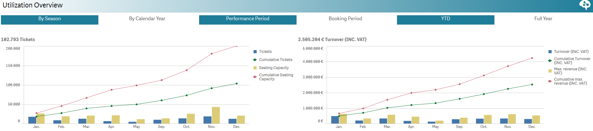
| Vue d'ensemble de la fréquentation/performance CA | This report keeps the same logic as the one before but focus on the utilization (amount of sold tickets + reservations) in order to show how full your venue has been in the past months and compare with last year/season.
|
| Rapports de ventes | Description | ||||||
|---|---|---|---|---|---|---|---|
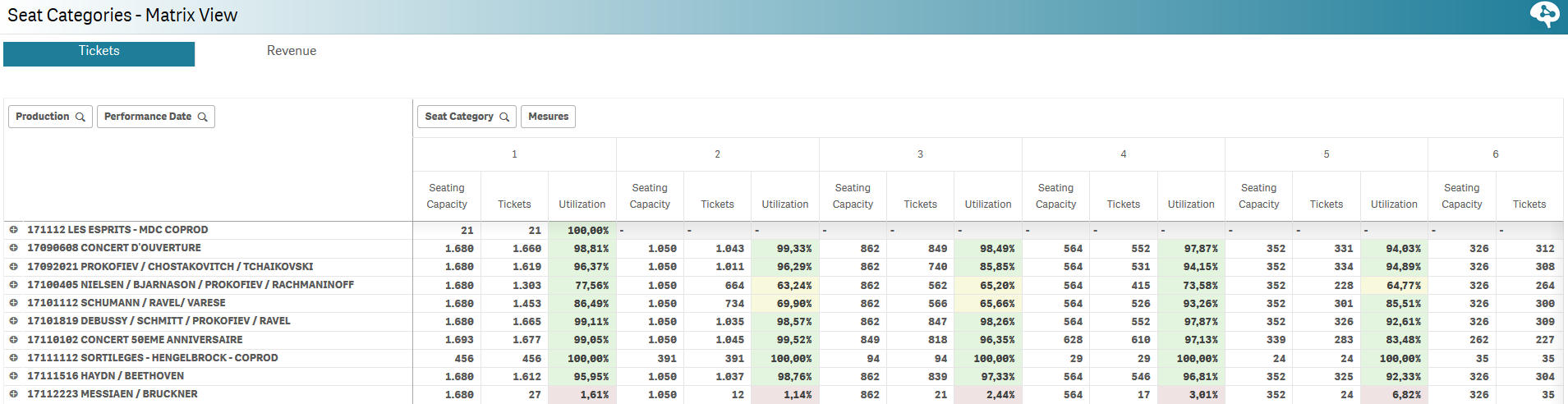
| Catégories de places - Vue matricielle | This report displays tickets or revenue data organized by events and performances. For each event or performance you can see the various information by seat categories. This enables you to get a better understanding of how your seat categories perform per event/performance.
| ||||||
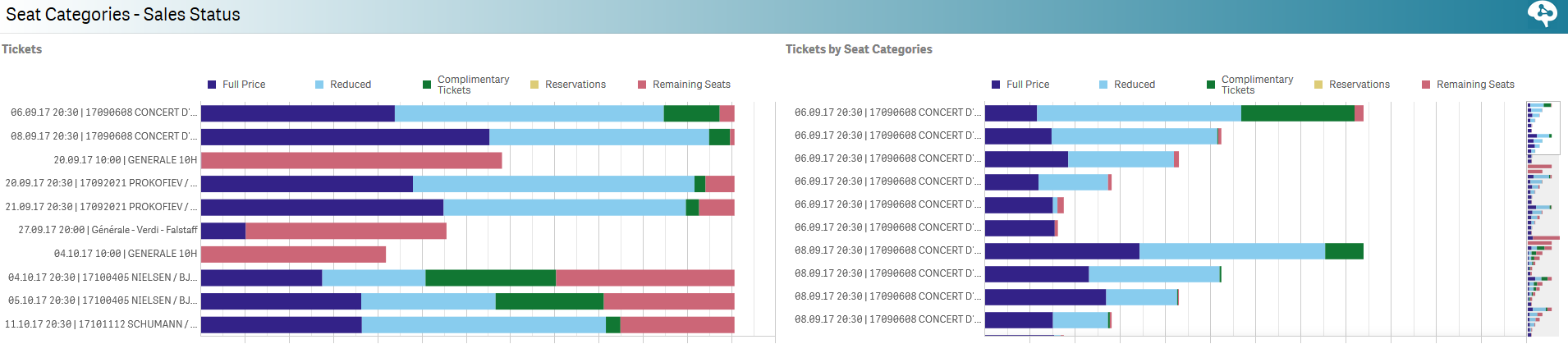
| Catégories de places - État des ventes | For each performance and seat categories, get to know the breakdown of the sales! See how many tickets have been sold full price, reduced, complimentary , etc. This enables a better understanding of the breakdown of each seat categories.
| ||||||
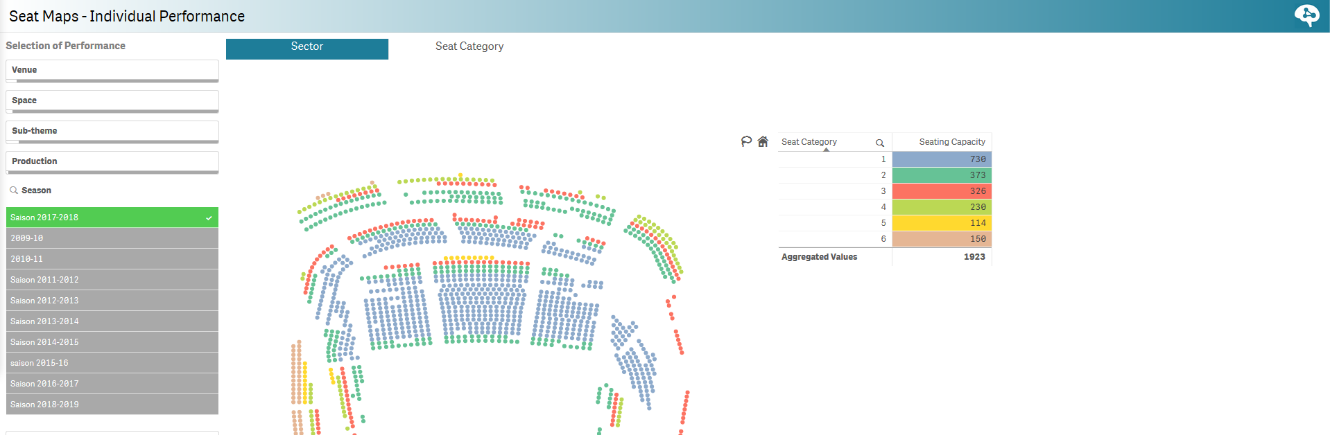
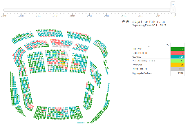
| Plan de salle - Séance individuelle | Select a specific performance and vizualize your seat map by seat categories or sectors.
| ||||||
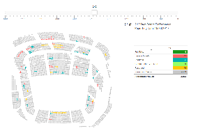
Plan de salle - Historique des ventes | Select a specific performance and use the scroll bar on the top to vizualize how your seats were sold in the time with a breakdown by kind of tickets (full price, reduced, season tickets, etc). This helps you to understand which kind of audiences book their tickets first. You can thus sharpen your marketing strategy.
| ||||||
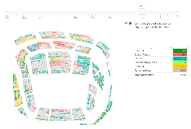
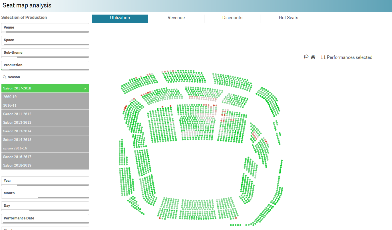
| Analyse du plan de salle | This report enables a gaphical analysis of your seat map for a chosen time frame. Then select if you want to see the seat map in terms of utlization, revenue, discounts or hot seats (seats that are sold very fast).
| ||||||
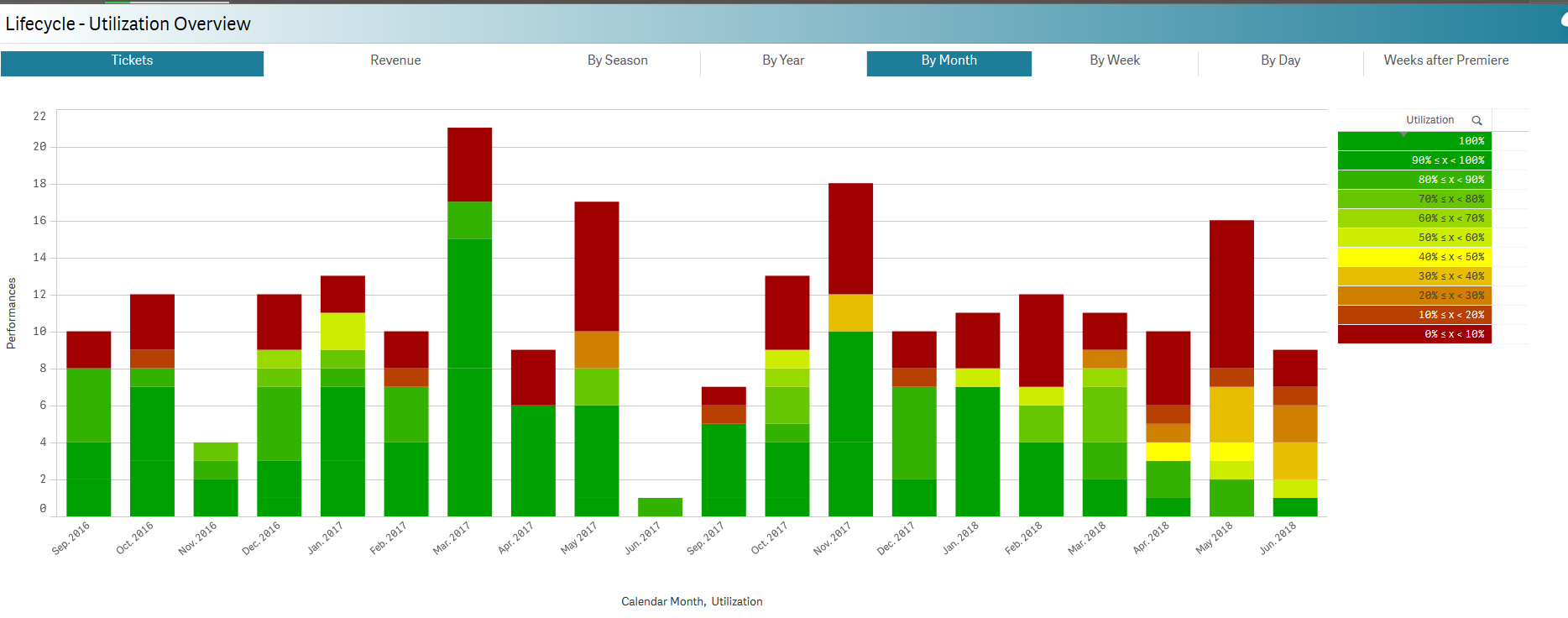
| Cycle de vie - Vue d'ensemble de la fréquentation | This report is one of the most useful for a season analyis. You decide if you want to analyze your data in terms of tickets sold or revenue and then, select the time unit for comparison. Drill down from a season view to a months view with a click and how your activity is doing compared to last year/month/season/etc. See below a comparison by months over two seasons in terms of utulization.
| ||||||
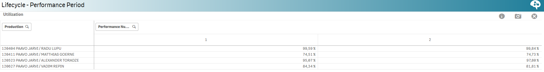
| Cycle de vie - Période de l'événement | This report will help to get a better understanding of events with multiple performances. The focus is set on the performance date and among others it helps you to compare how each performance of a same event is performing in terms of revenue or attendance.
| ||||||
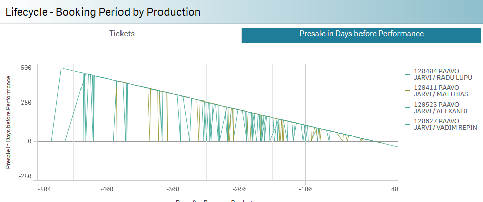
| Cycle de vie - Date d'achat de l'événement | This report is also made for multiple performances events but it focuses on the date of purchase. It helps you to understand when did people purchase their tickets: was it last minute or long time before the Première?
| ||||||
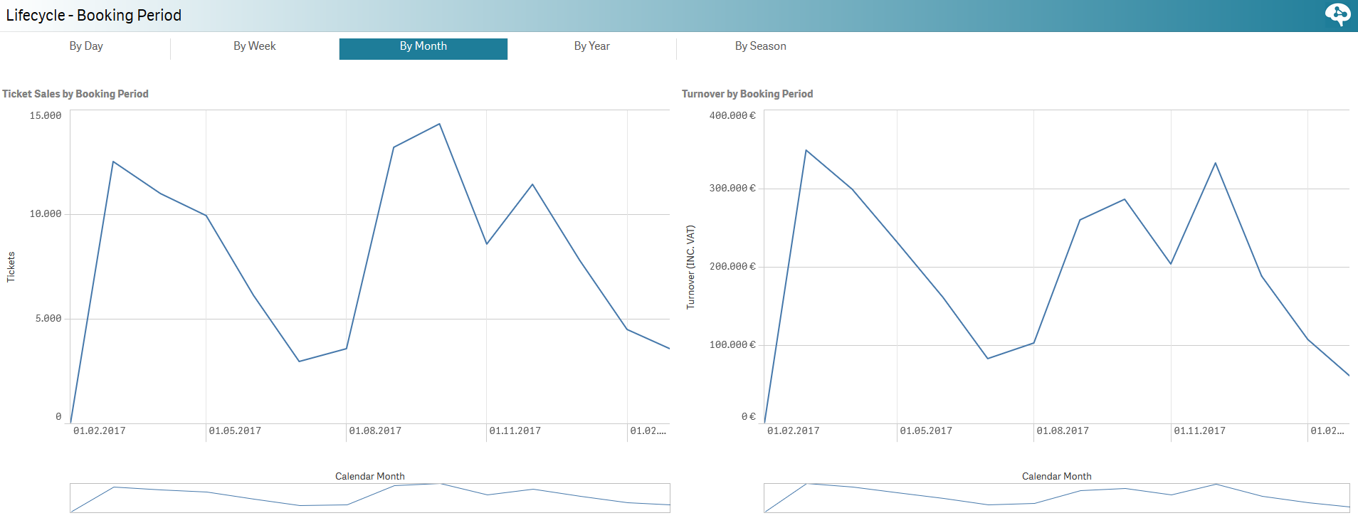
| Cycle de vie - Date d'achat | This report gives you insights in terms of sold tickets and turnover on a set of selected data (events, seasons, months, etc). The graphic below show us the booking timeline for the Season 17/18 by months.
| ||||||
| Analyse des tendances d'achat | Sales Trend history shown in two graphics (absolute or relative and by performance) in terms of tickets or revenue, (and in terms of price categories, sales channels, audience category or ticket types) | ||||||
| Comparaison des tendances d'achat | ?? | ||||||
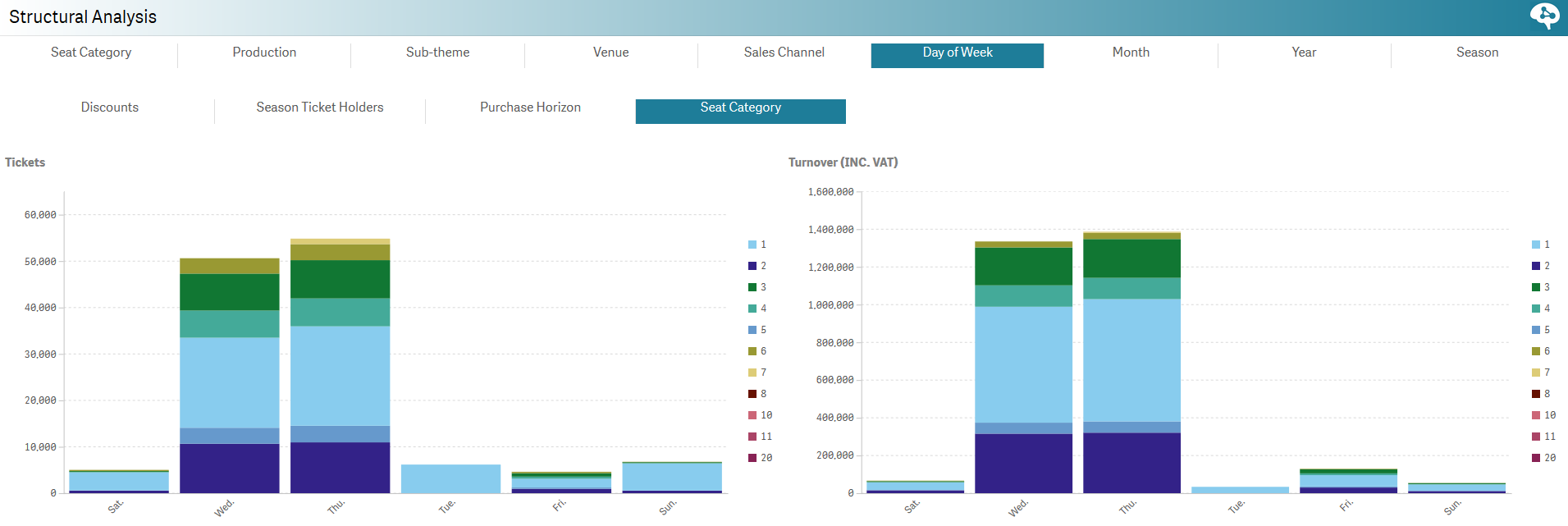
| Analyse structurelle | This report is a must! It enables the user to get a better understanding of the sales through a fine-grained analysis of different dimensions. The bar chart and the table automatically update the data depending on the user's selection. It is for exemple possible to see how the different seat categories are sold regarding the sales channels or the day of the week.
| ||||||
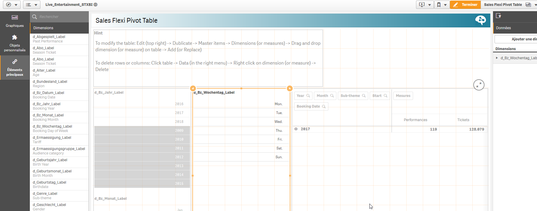
| Flexi Pivot des ventes | Using the drag & drop function, you can build your own tables. To do so, please copy the report sheet and edit the copy.You can then select dimensions and drag & drop them to get your data. Like a flexi pivot table in Excel, you can use formula to apply to your data.
| ||||||
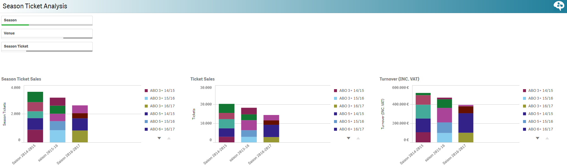
| Analyse des abonnements | This report gives you specific insights on your season tickets sales: number of sales, turnover it represents, amount of tickets it represents, etc. You can compare seasons tickets from different seasons and see how they perform in terms of sales, ticket sold within a season ticket and tunrover.
| ||||||
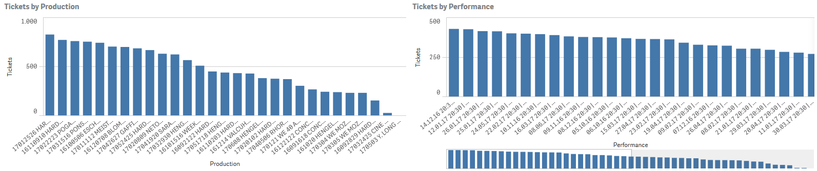
Abonnements - Détails | It is always interesting to know which events and performances season tickets holder prefer. In this report, you can see the top events and performances selected by the season ticket holders. This report is of great help to design your next season offers.
| ||||||
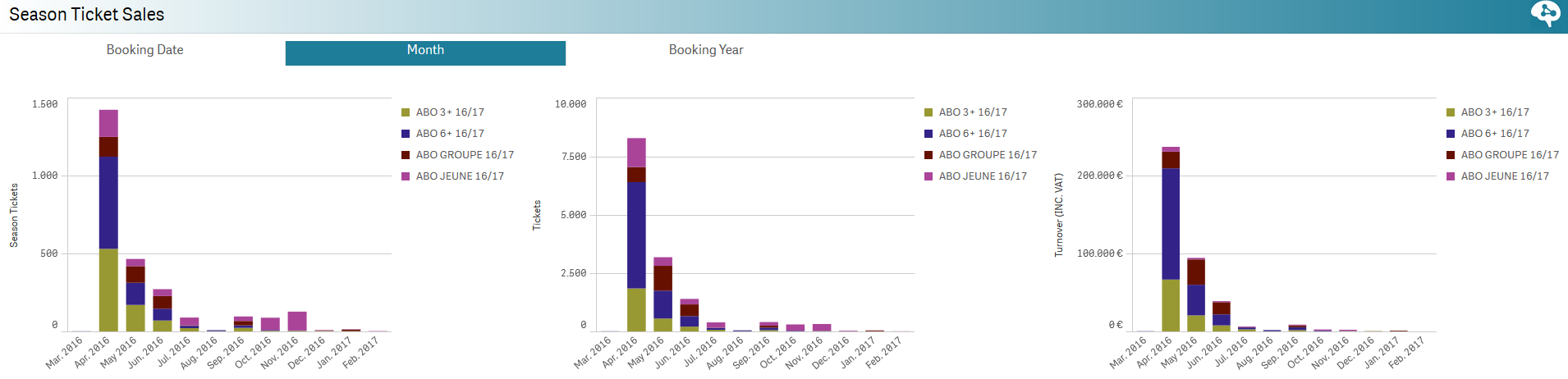
| Ventes d'abonnements | This report focuses on the sales timeline of your season tickets products! See by date, month or year when your selection of season tickets was sold! Get a better understanding of the sales timing and sharpen your marketing strategy accordingly!
| ||||||
| Ventes d'adhésions | This report is all about Memberships! Get a better understing of this loyalty product and know which of your memberships are the most successfull, the turnover they represent and when are the sales peaks. IMAGE!!! |
| Audience Management Report | Description | ||||
|---|---|---|---|---|---|
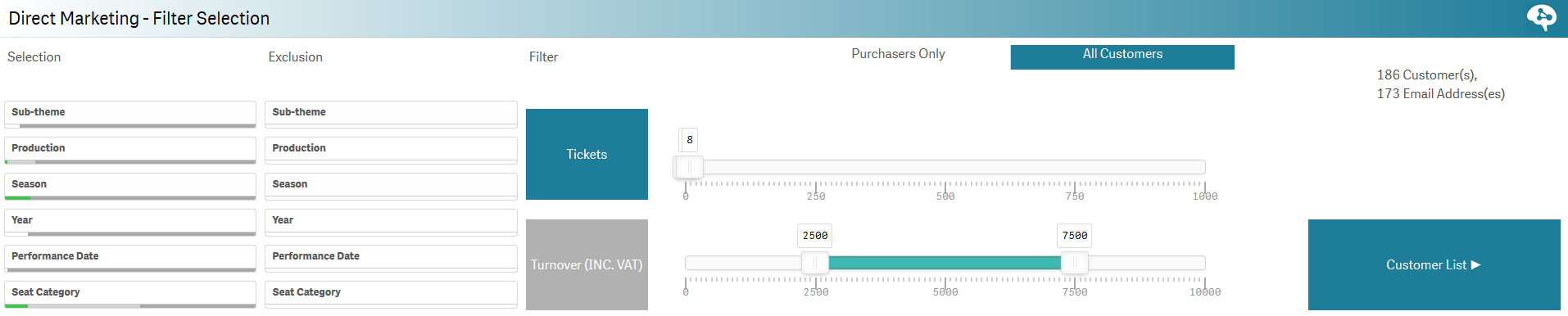
| Direct Marketing - Filter Selection | This is where you can make a selection of contacts. The two first columns are where you enter you inclusive and exculive contacts selection criteria. You can add additional filters on the number of purchased tickets, the turnover by contact, the estimation of overdue time before next visit and the number of attendance. Check also on the right-hand top of the page to see the acutal number of contacts in you selection. You can also decide if you want to look for all contacts or only purchasers (i.e. contacts with at least one purchase). Use the three buttons on your right to access to the contacts list, overview of you contacts or map view to see them on a map.
| ||||
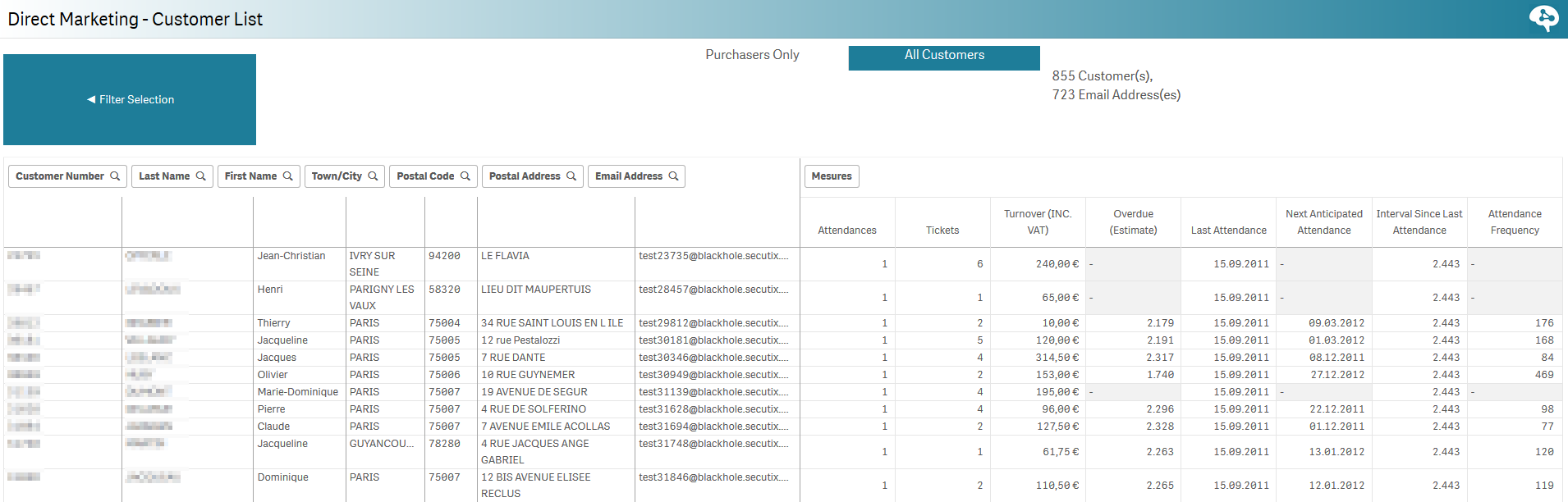
| Direct Marketing - Customer List | After you have done your contacts selection, go to the Customer list to get a list of your contacts with basic information and specific KPIs such as next antcipated visit, average attendance frequency in days, etc.
| ||||
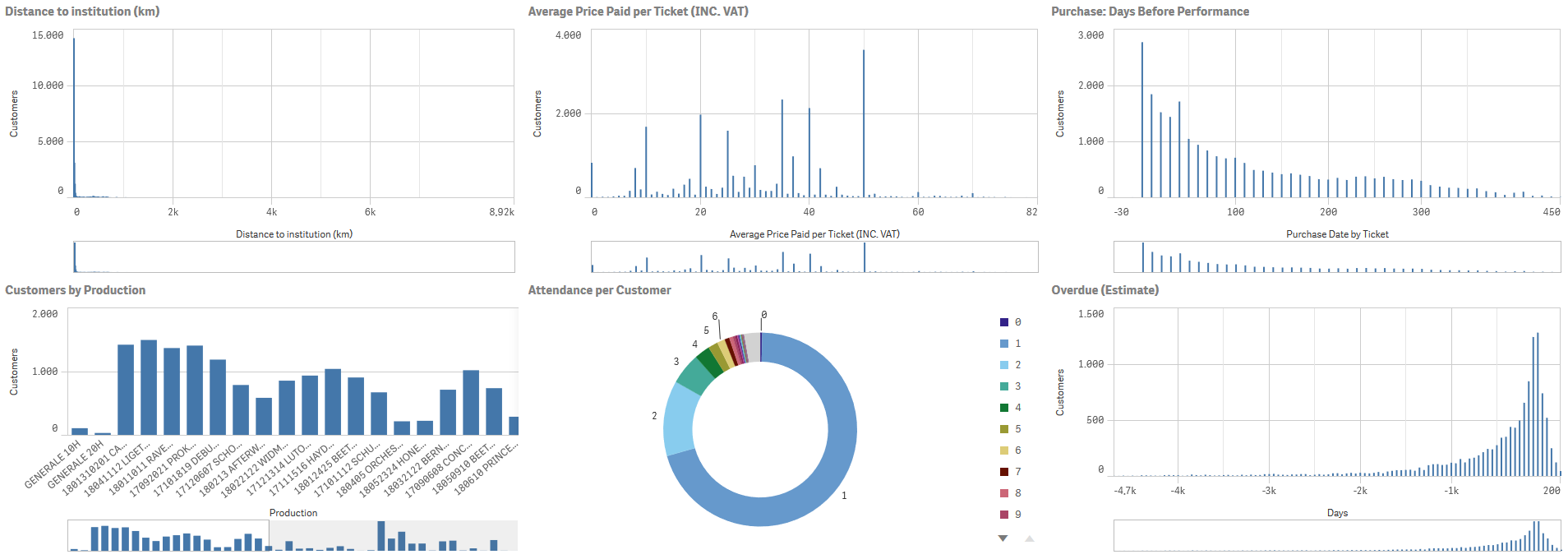
| Direct Maketing - Overview | Get a very visual overview of your contacts selection! See how close they live from your venue, the average price they pay for their tickets and when do they purchase them. See other key information about them such as the number of attendance!
| ||||
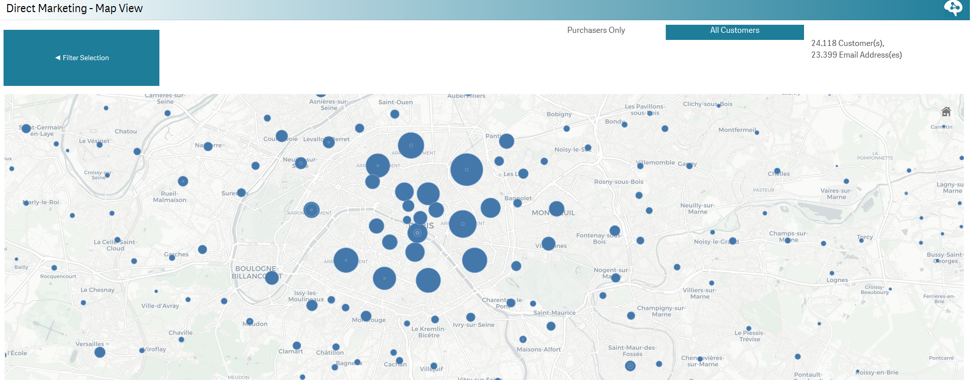
| Direct Marketing - Map View | See your customers on a map! The bigger the cluster is, the more customers you have in this area. Zoom/unzoom and use the lasso selection tool to select a group of contacts.
| ||||
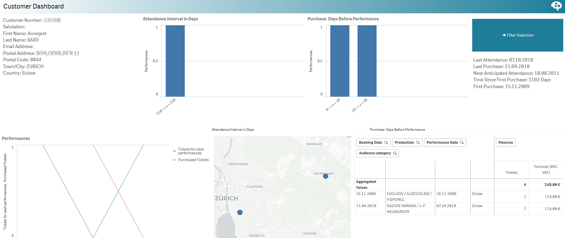
| Customer Dashboard | This dashboard provides you a focus on a specific contact! Get in one glance the key information about this customer such as the average interval in days between attendances, the average number in days between the purchase and the performance, his/her total turnover, etc.
| ||||
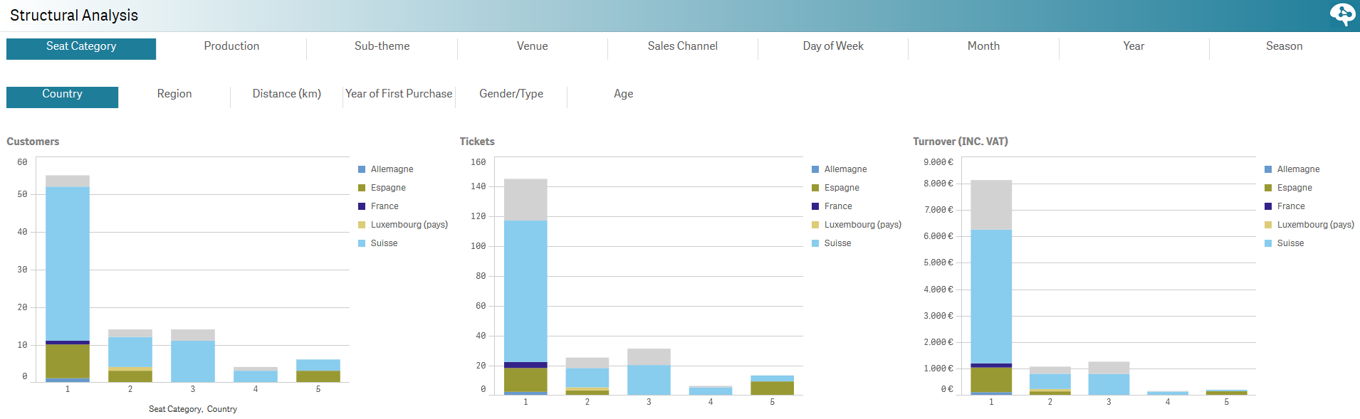
| Structural Analysis | In this report you can analyse your audience in regard to a chosen set of dimensions. You can combine one of the dimension in the upper panel with one in the lower panel. The bar charts and the table will respond to your selection. For example, you can see which production performed best for a specific age group or gender. Or which day of the week is most popular for people you live far away from your venue.
| ||||
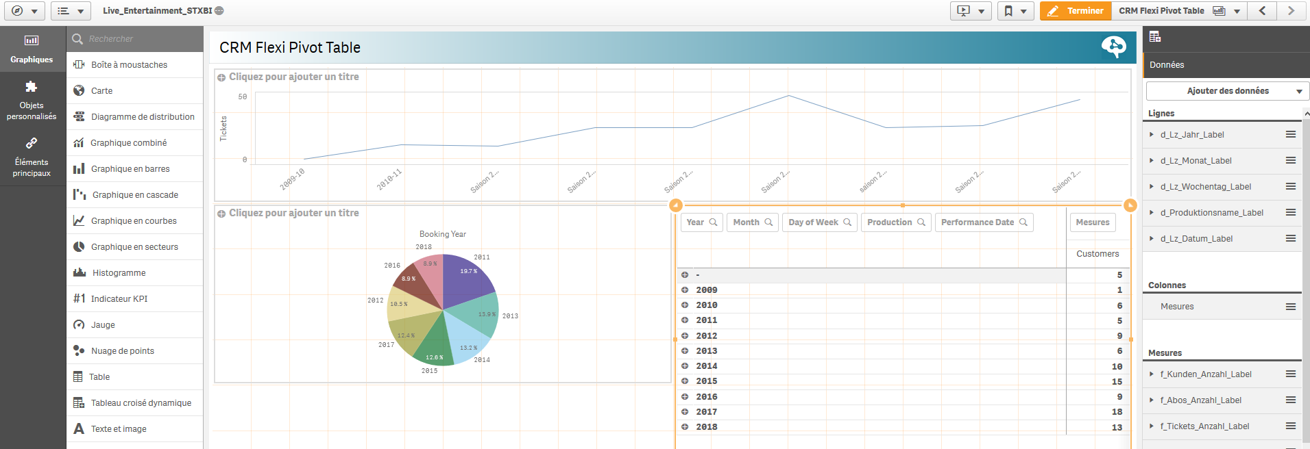
| CRM Flexi Pivot Table | Here you can build your own table, use the drag & drop of so called master dimensions. To use this feature, you have switch to the "modify" mode and duplicate the sheet. In the very left corner, dark grey area, you will find the master dimensions. Simply drag one of them into the table and use it as a dimension, or create a simple formula, using known arithmetic as sum, average, count.
| ||||
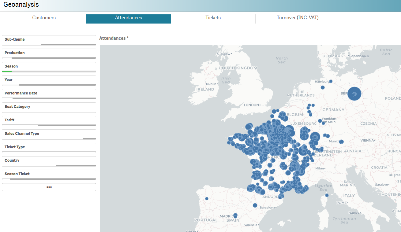
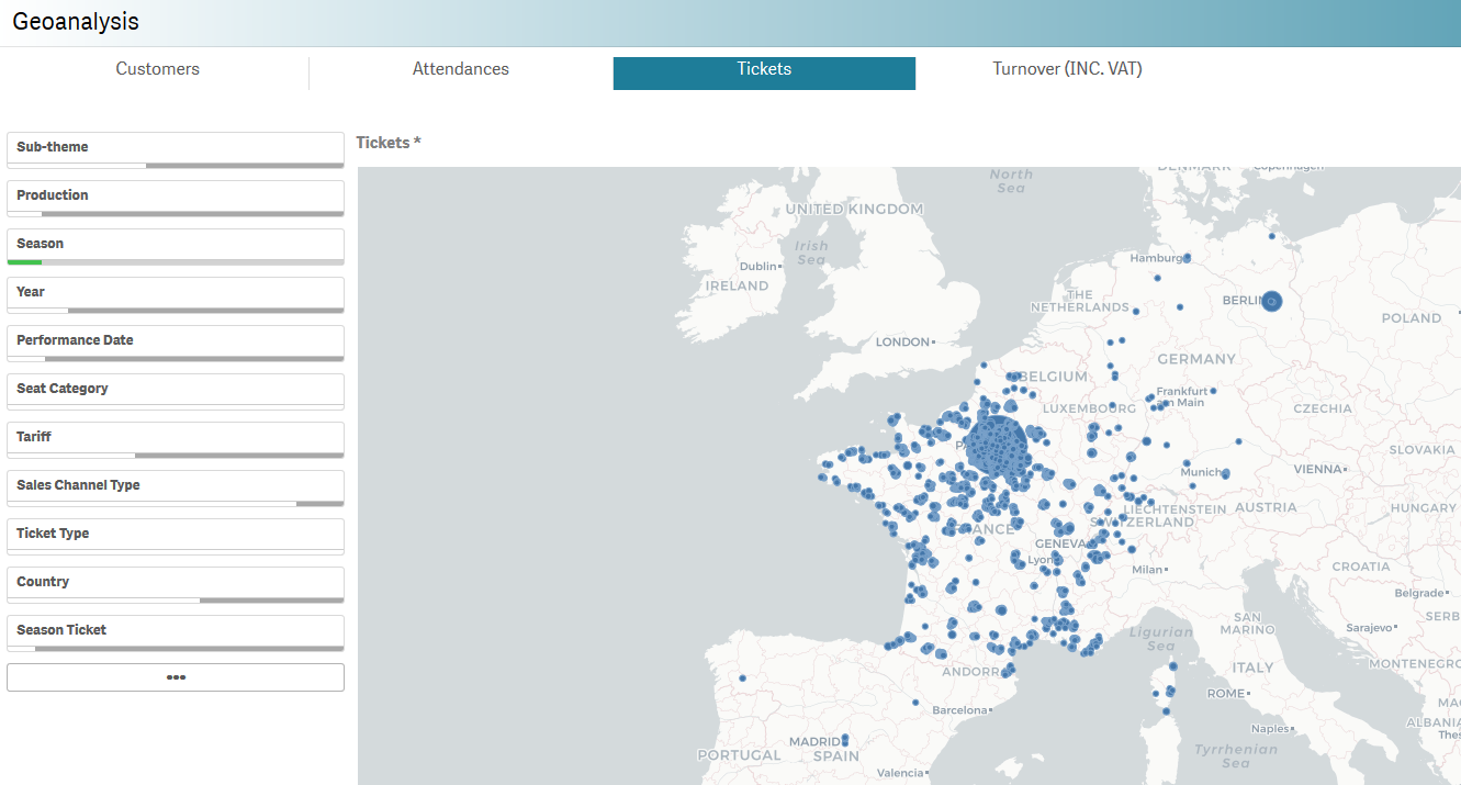
Geoanalyis | In this map, you can get a quick overview where your audience lives and which areas produce the most turnover or ticket sales. On the right side of the report you can quickly apply useful filters, such as Season or Sales channel.
| ||||
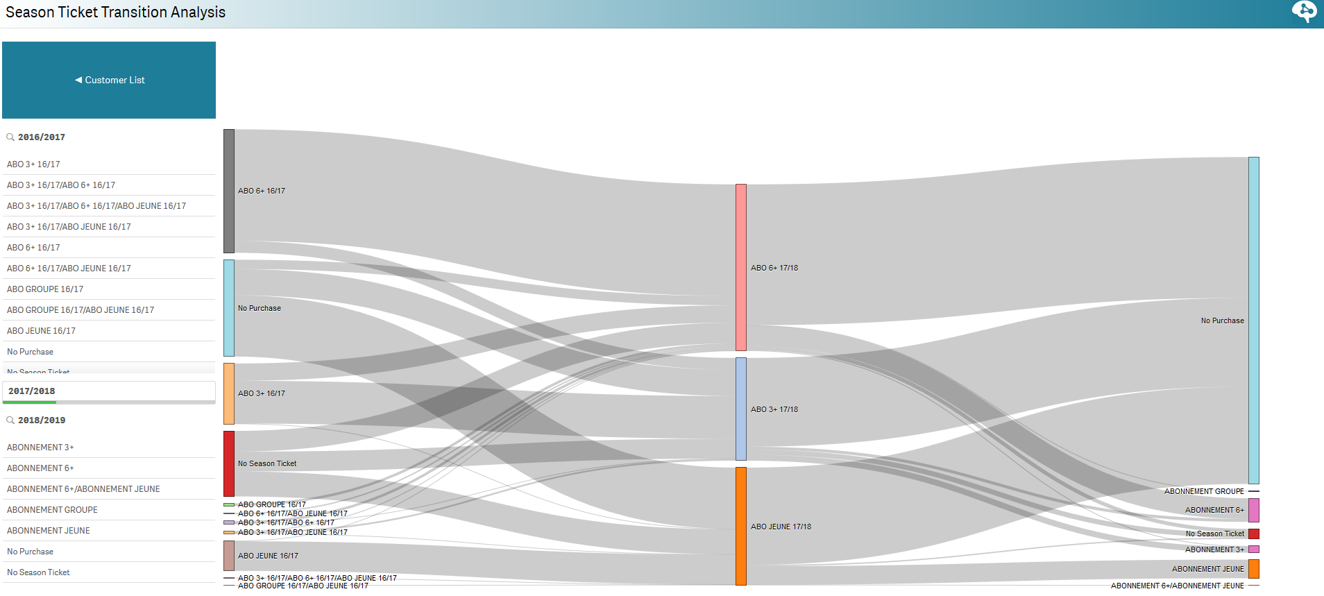
| Analyse abonnements inter-saison | This report shows you the flow of contacts who purchased a season tickets through several season. You can therefore check if your season tickets holders are new or loyal customers.
|