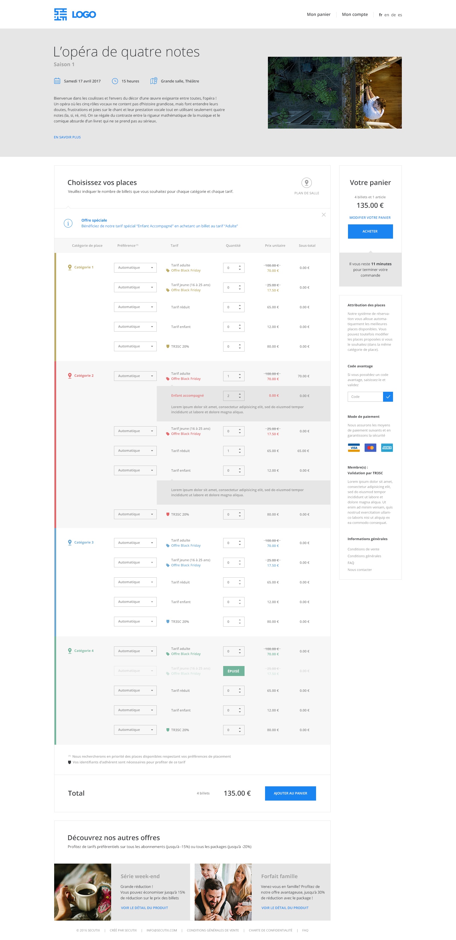
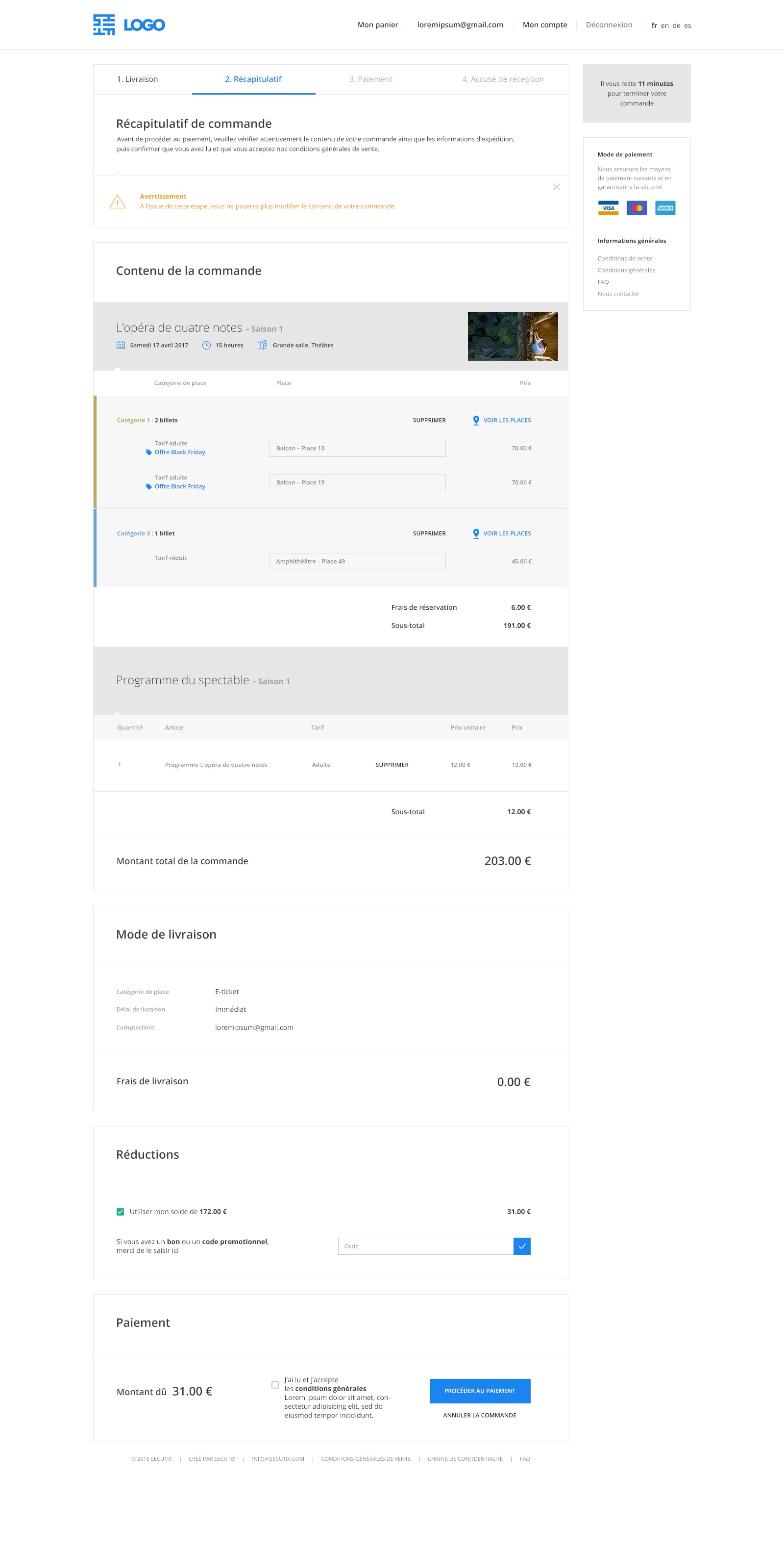
SecuTix online sales has a whole new look! Fresher, simpler and more contemporary, the new grahpics theme is right on trend. We present Equilibrium, a fully harmonised, balanced theme that will change the online visitor experience for the better.
A contemporary, balanced theme
Equilibrium is much more than a graphics layer. This new theme is intended to enhance the user experience. We've completely redesigned the on-screen information for more impact and a clearer hierarchy to achieve a balanced look. The new, harmonised imagery conveys all the information while significantly reducing page complexity. We've increased the spacing between elements to place more emphasis on the pace of the page content and on giving your content room to breathe. The result: improved readability. This line of thinking was also an opportunity to create more minimalist visuals, especially by utilising white space, making embedded content easier to see.
Graphic customisation is changing
Just like the Classic SecuTix theme, Equilibrium can be graphically adapted to reflect your corporate identity as closely as possible.
For as long as PizBernina V1 runs, you'll be able to choose between the classic theme and Equilibrium. To make your selection, go to the "Internet theme" page for the point of sale concerned, where you'll find two radio buttons that allow you to switch. To maintain backwards compatibility, the customisable fields shown (such as colour, background image, rounded borders, etc.) are still the same in the settings window. However, they now produce slightly different results, so before switching to Equilibrium, we recommend that you do a reset (link at top right of page).
| Info |
|---|
Please note that the Classic theme will only be available for a limited time, so we'd encourage you to migrate to the new theme during PizBernina V1. |
Usage recommendations
Here's a list of usage recommendations to help you make the most of Equilibrium's elegance while also conveying your visual identity.
Typeface
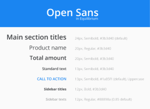
Layout is now more flexible thanks to the larger centre column: you can now change the font of any text – not just headings.
Unified background colours
One of the best features of the new theme is the unified colour selection. So we'd encourage you to use the same background colour for the main area and the heading background. If you change the main background colour but leave the heading backgrounds blank, they will automatically adapt to the main background.
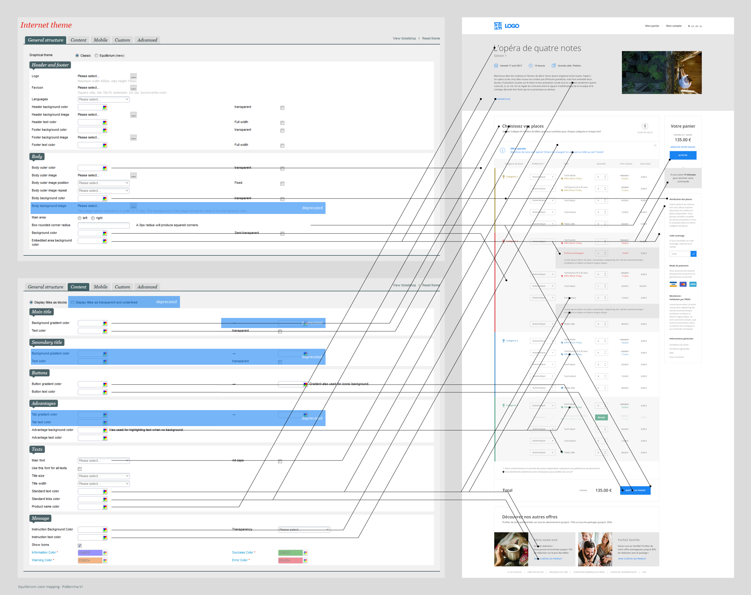
It's important to note that there are three content background colours: "Body background colour", "Background colour" and "Embedded area background colour". These three variables allow you to define:
- the main background colour for the content
- the colour used for alternation (e.g. where the background alternates between two seat categories, which is sometimes called the pyjama effect)
- the colour of embedded content.
For best results we think it's preferable to choose three different colours that progress in one direction: for example, the Equilibrium base colours are pure white, very light grey and a slightly more solid grey. Note that the embedded content colour can also be used for borders. Ideally this should contrast slightly with the main background colour.
Background images
You can still choose the same background image for the whole page. However, if you use an image with too high a contrast or add transparency effects to the internal background colours, you may find that the content is harder to read.
The background image for the centre area is no longer available.
Buttons and links
Equilibrium also has more granularity in terms of call to action buttons.
Key actions are still represented by buttons in distinctive colours. Secondary actions, on the other hand, are now available with three levels.
- The most important are in a distinctive colour and are accompanied by an icon.
- Simple actions have no icon.
- Actions that you would rather customers avoided (such as cancellation) are not in colour and appear in the default text colour.
We'd also like to highlight that rounding is now applicable to other features as well as buttons.
Default text colour
The default text colour variable applies to lots of elements, but sometimes with a moderate lightening effect (slightly opaque). So don't be surprised if certain elements appear a little lighter or darker – it's a deliberate nuance that we've built into Equilibrium.
Colour mapping
The image below shows a detailed view of the variables that influence Equilibrium's visual impact. You can consult these in: equilibrium-colour-mapping.pdf.
