| Excerpt |
|---|
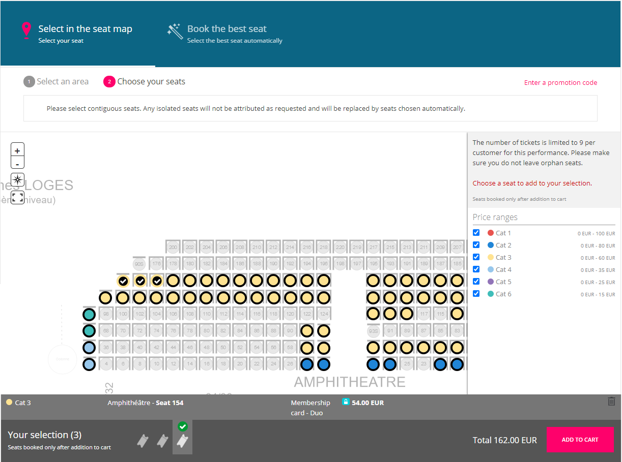
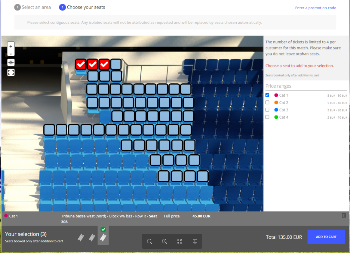
The seat map |
| Status | ||
|---|---|---|
|
now uses text and icons to communicate the selected seats, selectable seats and seat |
categories to improve usability for visually impaired users. |
For visually impaired internet users, it's very difficult for them to distinguise between the difference seat categories, as well as the different between selectable seats selected seats.
In order to improve usability, we are now using icon and more contrast color to distinguise between these differences:Thanks to more contrasting colors, highlights and icon, the overall seat selection experience gains in clarity for all your visitors. |
Solution
When first landed on area selection, hovering over an area:
- The selecting area is highlighted with stripped.
- The available seat categories are displayed with infomation information about name of each seat category.
When landed on seatmap:
- The available seats are now highlighted with a black thick outline
- The selected seats is displayed with a checked icon